

Fonts are one of the most overlooked elements of website design, but one that can prove crucial in achieving the goals set through them.
As you may have guessed Google fonts are a set of fonts contained in a real topographic type library, specifically it is a set of application programming interfaces or better are known as APIs. Specifically it allows all users to use web fonts on their App or website. Especially they can be used freely since they have a free license, in detail it is a library that makes available to everyone a real interactive web directory that is essential to make easier the selection and management of fonts through Android and CSS.
This service is made available by Google and all the fonts present and bandwidth are definitely free.
For this reason it is necessary to choose very carefully the most suitable fonts for one’s case, so as to optimize the technical performance and make the website pleasing to the user’s eye.
What is Google Fonts?
Google Fonts is a free license to simplify fonts via CSS and Android. Google Fonts was created to simplify the search for fonts, made available for free under open source licenses. They can be used for both commercial and non-commercial projects.
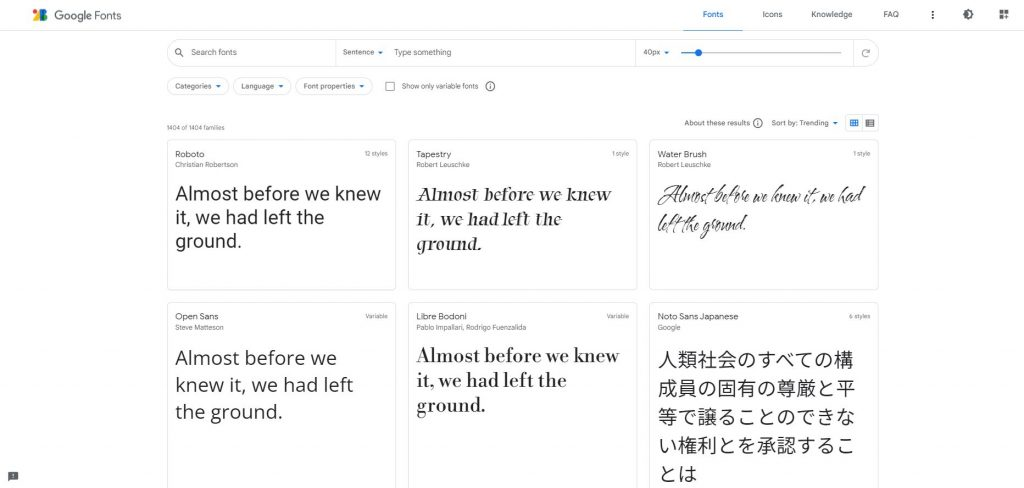
Within the site, through the appropriate search command, we can choose the font aesthetically best suited to our case and invoke it within our site, to have the text on a given page formatted through such dictates.
Indeed, with the establishment of the first CSS specifications, the need arose for web resources to easily retrieve fonts not from local terminals but from servers, so as to ensure proper display for all.
Google Web Fonts-now Google Fonts-has replaced the earlier TypeKit in providing fonts for embedding in websites: it is enough to integrate the appropriate code into the HTML or CSS of the site to ensure the same display for all devices.
The fonts from which we can choose are divided into:
- Serif (font with graces), small extensions at the end of letters that appear to bring them closer to each other, such as Droid Serif;
- Sans Serif (fonts without graces), such as Roboto and Open Sans;
- Handwriting (fonts that resemble handwriting), such as Shadows Into Light;
- Monospace (fonts whose characters are the same width and have a style that resembles typewriters) such as Inconsolata
- Display (fonts with very closely spaced letters) such as Lobster and Poiret One, generally suitable for large projects
Fonts should be chosen in agreement, without overdoing it so as not to make the site too heavy; opting for more than two or three fonts per page would make reading it more tiring.
Advantages of using Google Fonts
Google Fonts, as mentioned, are aesthetic website assets that can boost dwell time and conversions to CTAs. In fact, they offer several advantages:
- library of free and secure fonts (being provided by Google)
- freely usable fonts for commercial and non-commercial projects (no licensing restrictions apply)
- improve the readability of pages
- definitely lightweight (they make the loading of the web page hosting them faster)
- very versatile: available in numerous versions to accommodate everyone’s visual and formatting needs
- ensure that the fonts are compatible with every site and application
- aesthetically attractive
All Google fonts meet precise Google community standards and prove to be definitely compatible with most sites.
Why use them?
As we know, the fonts used can have an even substantial impact on web page loading times and content readability. They therefore translate into important elements for the user experience of the page, which in turn can affect the ranking through the liking signals produced by user experience.
Google Fonts are designed by Google to make the file arrive as lightly as possible in relation to the fruition technologies used.
With a shorter loading time we can achieve a lower bounce rate for our web page, increasing the chances of conversion. In fact, a font that is difficult to read discourages from reaching the end of the page and pushes the user out before responding to calls to action.
Which Google Fonts to choose for our site?
Typography can prove very valuable for one’s site. A suitable font for one’s project reflects the aesthetic style of the website, is very readable and conveys a certain personality.
In the store there are over 1040 fonts among which we will certainly find the one that suits us. Also, as mentioned, the fonts are available for free, so we can experiment with one or the other until we find the one best suited to our site. So let’s take some time to choose the right font to the layout of our site that will be more enticing to read.


+ There are no comments
Add yours