

As you can imagine, color is a prominent element in visual content that in its own right can capture the attention of the viewer. Coloration is an element that can influence people’s state of mind, and therefore can prove crucial to the effectiveness of marketing strategies.
You may never have noticed, but an advertising campaign can have more or less effect depending on the colors it makes use of.
The psychology of color in marketing
Color is of great importance in the final effect of a catalog, a website, a brochure, decor, a logo, and there is a real “psychology of color” apt to determine the effect it can have on the minds of consumers.
Satyendra Singh, in his study “Impact of color on marketing,” determined that about 90 percent of consumers’ actions toward products are dictated by the effect of colors.
Colors can influence the beliefs a person already has and his or her determination to buy or not to buy the product. Of course, the positive effect of color cannot literally hypnotize, but it still incentivizes an already predisposed user to buy.
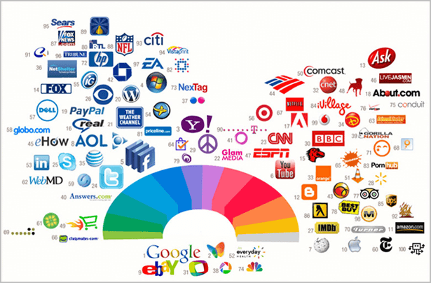
The human brain also identifies a brand by its distinguishing color: a good strategy is to enhance one’s logo with colors that are conspicuously different from those of competitors, so that the audience can easily memorize and distinguish it from others.
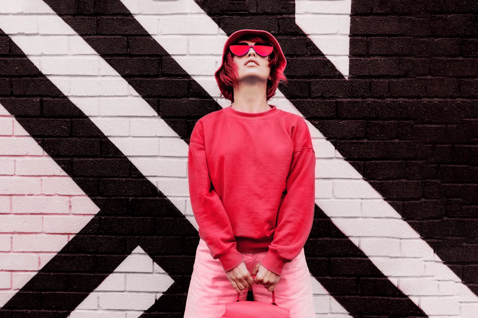
Color should therefore be representative of the brands qualities: red suggests vitality and passion, blue tranquility, green naturalness, pink sweetness, so depending on the message you want to convey you can choose a good combination of graphic elements, colors and personality.
Color can subconsciously convey meaning in a matter of seconds, which can affect the perceived effectiveness of products and services. Therefore, it is crucial to adopt the best color choices to make a good impression on your target audience.
Marketing color matching
Colors should be chosen based on:
- the industry in which you operate (e.g., red can evoke passion but also make people think of blood)
- the brand awareness (yellow might be the best choice, but if a competitor already uses it, it is better to go for another color)
- to the feelings one intends to arouse in the viewer (green makes one think of nature but also stands for anger)
- to the characteristics and functions of the products (blue makes one think of tranquility and slowness, and in the case of goods sold as energetic and dynamic it is not the winning choice)
The choice of colors is also influenced by the gender of the target audience: men and women are predisposed differently to colors, and a good choice of color shades affects the way the campaign will be received.
Colors in business
The meanings of colors vary from culture to culture, but in general there are feelings they evoke universally.
Marketing color palette
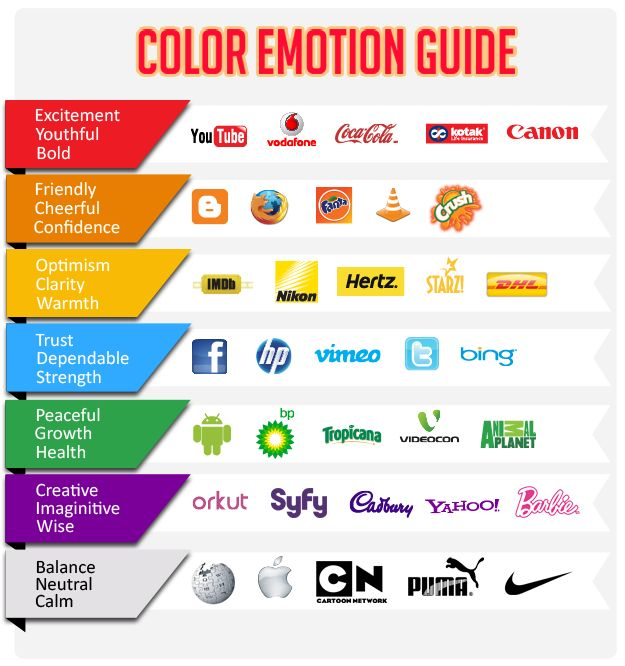
- green: is a color that inspires balance and hope, calling to mind the idea of nature
- white: is the color of divinity and is particularly used in association with hygiene products. It carries a meaning of purity and transparency
- blue: is the color of relaxation, harmony and balance, it evokes security and tranquility
- pink: it is a delicate color and represents the feminine color par excellence
- orange: arouses vitality and action, makes one think of friendship and understanding, courage and energy, and is used for elements in which it calls to action (e.g., calls to action). Popular for products aimed at adolescents.
- purple: evokes relaxing feelings and an idea of beauty, so it is used for wellness products. Typically connotes an idea of nobility and wealth.
- brown: symbolizes emotionality and sensuality and connotes an idea of naturalness, so it can be used for natural products
- red: conveys vigor, passion and strength, it is used for more aggressive messages
- yellow: symbolizes sunshine and vitality, has a youthful connotation and is perfect for attracting attention. It can be used for products related to children or to invoke the idea of very affordable offers.
- Black: it is recognized as formal and elegant, and is popular for luxury products or for services that denote professionalism such as lawyers
Blue is the most popular color for both sexes, and green is also very convincing. In fact, it conveys security and reliability and is very suitable in those cases where you need to convince the viewer that you are trustworthy, as in the case of financial products or security services.
Women most appreciate kept and light colors, primarily purple (which is not appreciated by men, however). Make-up, which is typically feminine, makes use precisely of shades of purple and black to impress female viewers.
Green is a creative color and is used to elicit a feeling of contact and naturalness.
Men prefer bright colors and denser shades, green and black, which is a symbol of elegance and sophistication. Orange and brown, on the other hand, are among the least liked colors.
Colors directly influence the propensity to buy: for example, red, orange, blue and black lower resistance to purchase and therefore are frequently used in promotional offers. Light blue and pink are very calming colors and are applied for messages with a traditional tone.


+ There are no comments
Add yours